Infinity Renewable Energy
Corperate Branding
As an 8-week project, my professor assigned our class to review Infinity Renewable Energy's traditional brand to ensure it is friendly, modern, and suited for the everyday customer. We were given a small document containing the customer's needs and a brief history to start.
I created the copy for branded text within the project such as the in-depth version of IRE's history and brand guidelines.
After submission, I continued to iterate by creating a design system and a live demo site through Wix Studio.
The Solution
The Ask
The Ask
The Benefit
The Problem
The Challenges
The Solution
The Benefit
While focusing more on products that families and neighborhoods rely on, it's best for IRE to rebrand with a friendlier, more open, and kinder look and feel. This will significantly impact the level of support they receive through viewer engagement and online click-through rates, and, of course, increase sales of their new products.
The User Experience
By creating a more welcoming and approachable image, IRE can make customers feel more comfortable and valued, leading to improved satisfaction in the overall experience. When you create with the end user in mind, improving branding increases awareness of accessibility and visibility needs along with figuring out pain point of potential customers. Ultimately this creates to stronger engagement, a positive customer experience, and return and recommended customers.
Challenges
Stand out branding
We wanted to focus on the natural world, create a sense of calm and joy, while keeping it modern and sleek. IRE also wanted to stay away from using colors a typical "green" company would use as it could build distrust as many "eco-friendly" companies use varying shades of green to highlight their products that are incredibly greenwashed.
Previously, IRE's colors were very simple, black, white and a canary yellow. When they first started, the founders decided on funding the technology and science behind the company rather than the design. This worked well for a wile but eventually IRE understood that they would have to invest in a new look.
In doing this we decided on three hero colors, Mariana, Terracotta, and Nimbus. Given the history of IRE starting 50 years ago in southern California, and the deep love for renewable energy to better impact and protect the earth, these colors were agreed on. These primary colors show up as distinct individual colors and can be used together to create a new, sleek and calming renewable energy brand.
Competitor colors
IRE's first brand colors
IRE's new primary colors
Terrcaotta
Spanish tiles on californian homes.
Nimbus
Dusty blue sky mixed with clouds.
Mariana
Inspired by the depths of the Mariana Trench.
Brandguide
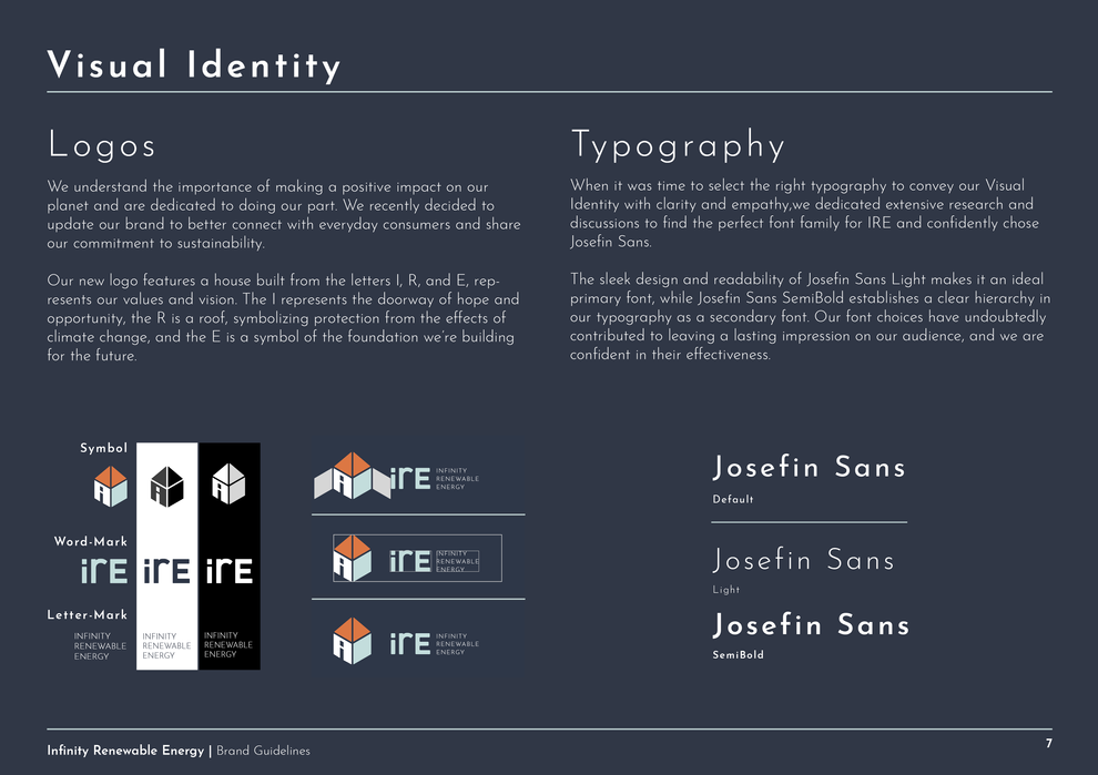
I'm excited to share with you the corporate branding I completed for IRE, a university project focused on rebranding to launch consumer-focused products. The rebranding was aimed to capture their mission towards sustainability and align it with modern consumer needs. The end result is a cohesive and captivating brand identity that's designed to engage and inspire.
My approach included a comprehensive analysis of consumer behavior and industry trends. The new branding aims to capture the company's mission and core values in a modern and captivating way that appeals to the end-users.

IRE needed an updated look and feel to match the branding message of coming across as reliable to D2C consumers.
Here you can see the notable stats and goals for IRE's rebranding launch.
The Problem
38
Years of Experience
75
Countries use tools & services
90k
High-skilled employees
50
International
Partners
Potential D2C customers
Efficient Products
Make IRE a
household name

IRE needed an updated look and feel to match the branding message of coming across as reliable to D2C consumers.
Here you can see the notable stats and goals for IRE's rebranding launch.
The Problem
38
Years of Experience
75
Countries use tools & services
90k
High-skilled employees
50
International
Partners
Potential D2C customers
Efficient Products
High-skilled employees


